Sanzo Wada Color Film Tests

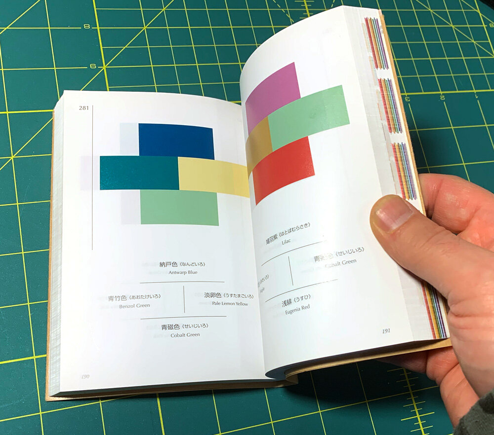
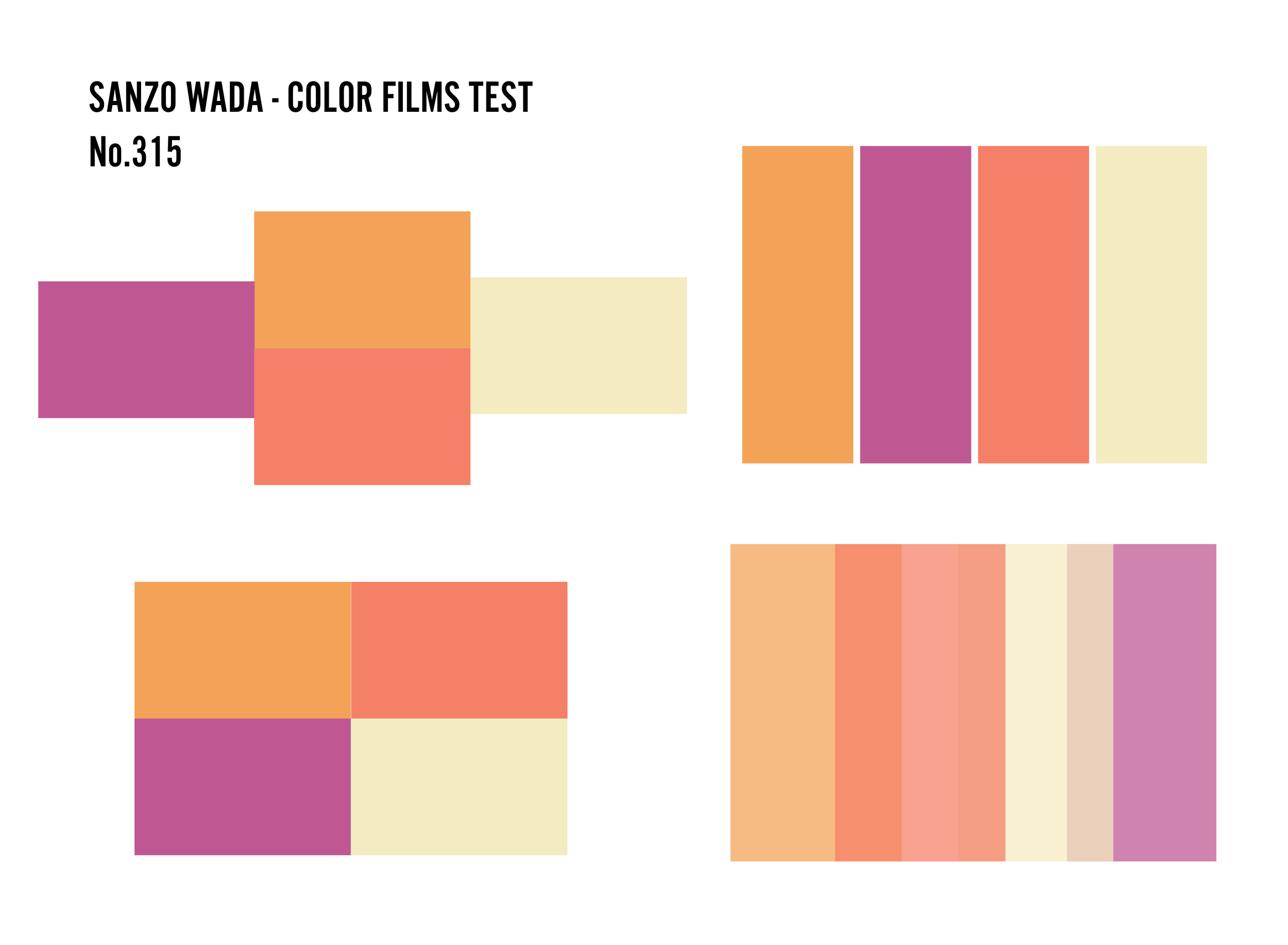
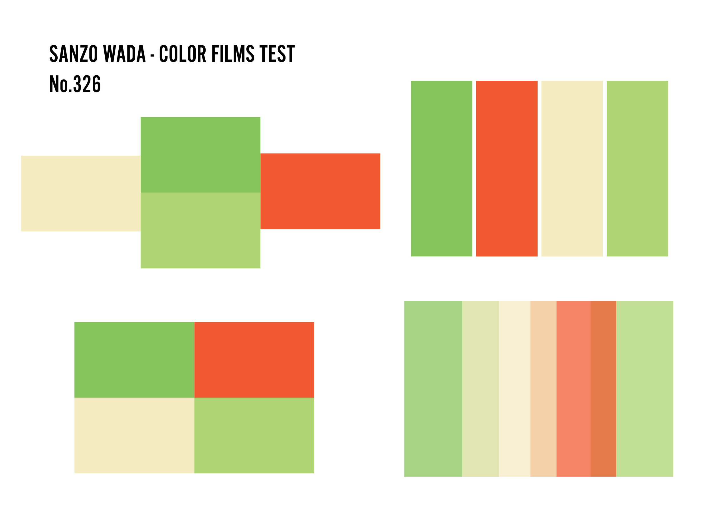
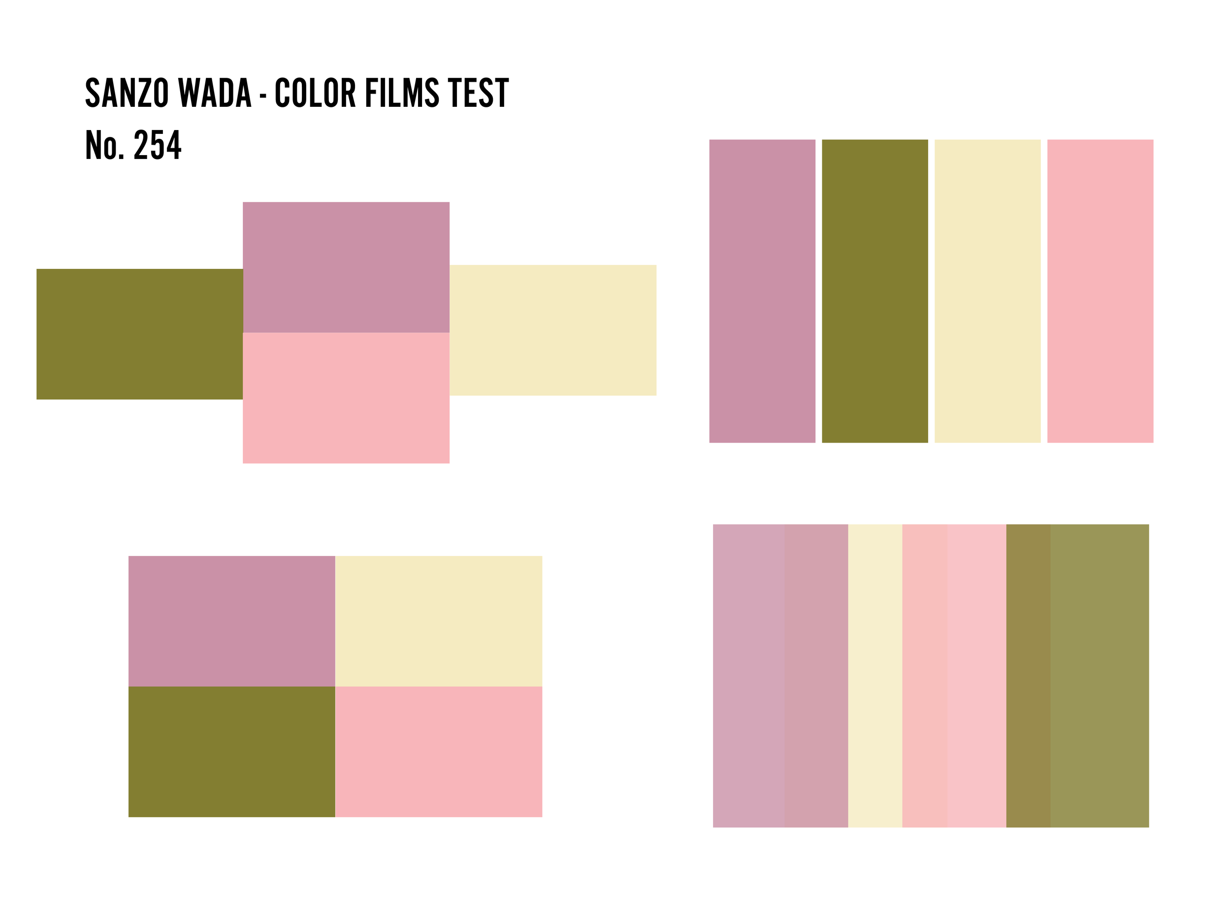
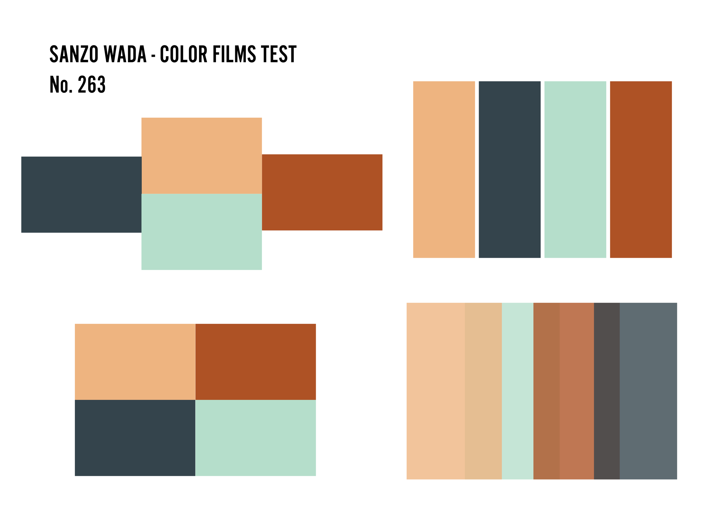
A little over a year ago I came across a very interesting book of color combinations first published in the 1930’s by a Japanese artist I was previously unfamiliar with named Sanzo Wada. I’ve been an avid collector of books on color combinations for years, so I was a bit surprised that I had never known about Sanzo Wada or his influential work prior to finding this book last year. His book, aptly titled A Dictionary of Color Combinations, was published in six volumes during the 1930’s and laid the foundation for modern color theory. The contemporary softcover reprint of volume 1 contains over 300+ color combination, all based on a library of 160 colors - very classic, muted soft colors with names like Diamine Green or Eosine Pink - and arranged in combinations of two, three and four.

A Dictionary of Color Combinations, Vol.1
What makes this book (and author) stand out from the hundreds of other books out there on color combination is the fact that Sanzo Wada - prolific artist and costume designer in pre and post-war Japan - was the first person to investigate the harmony of color combinations and meticulously catalog his work in books dedicated solely to his research.
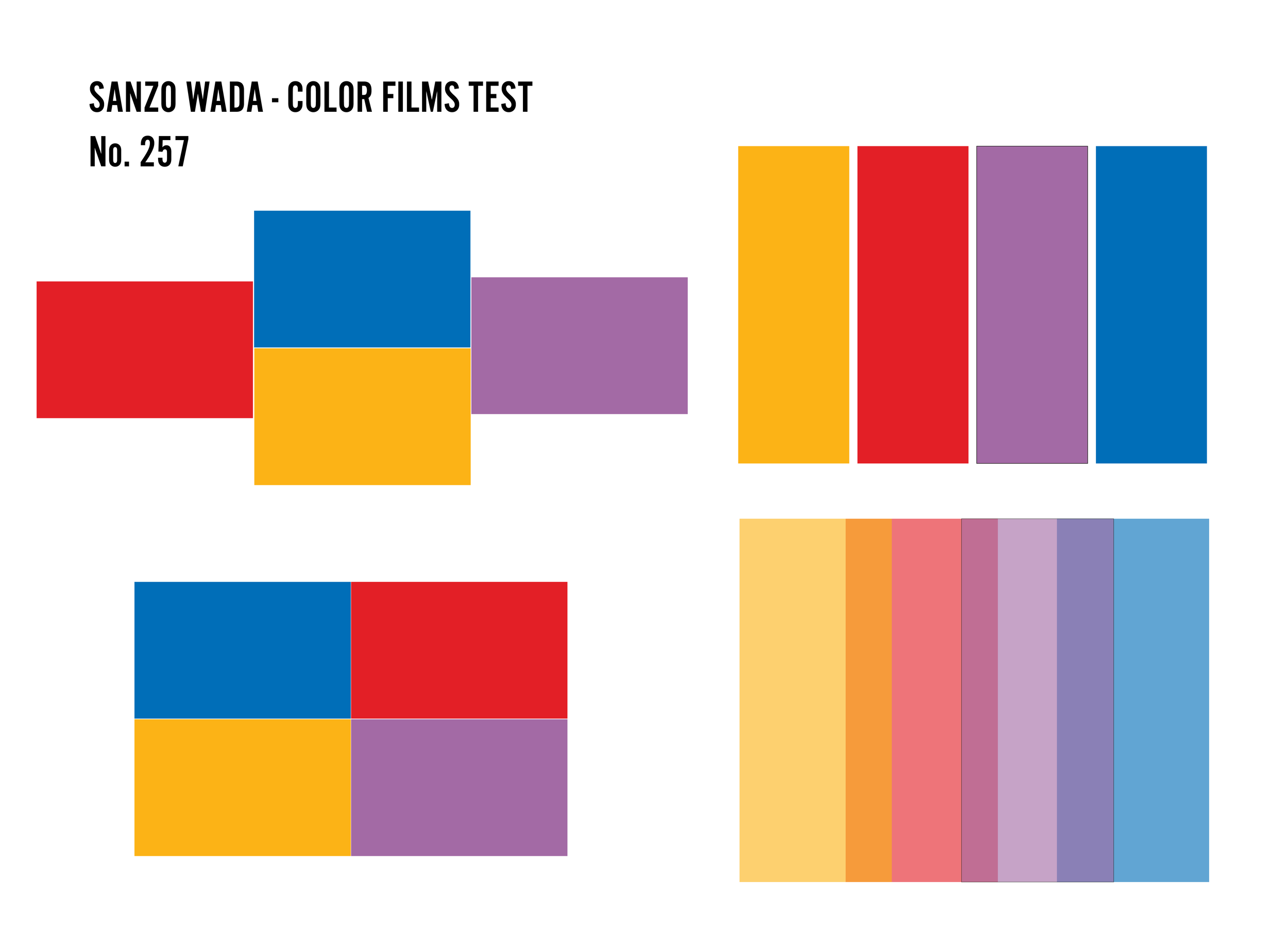
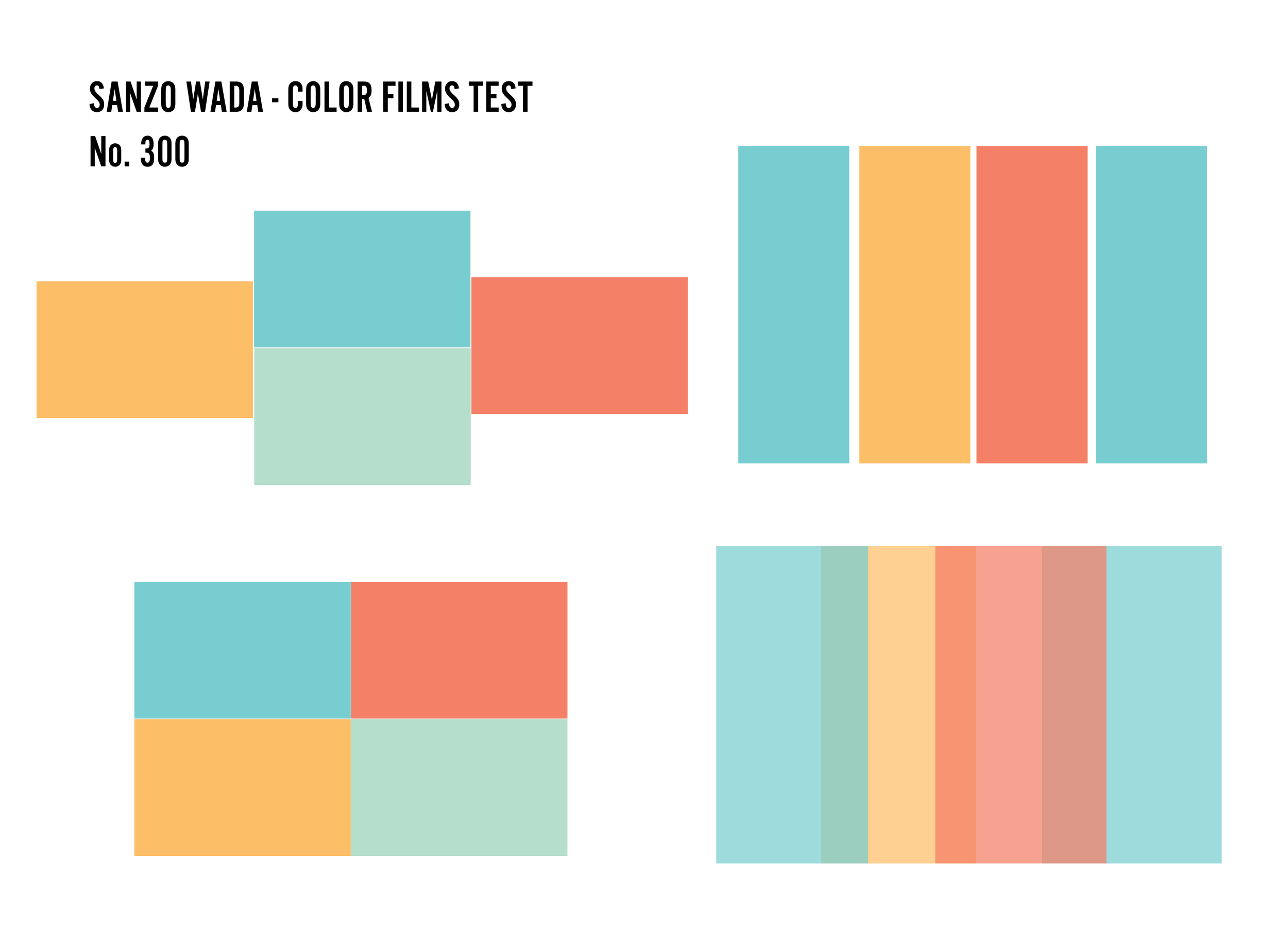
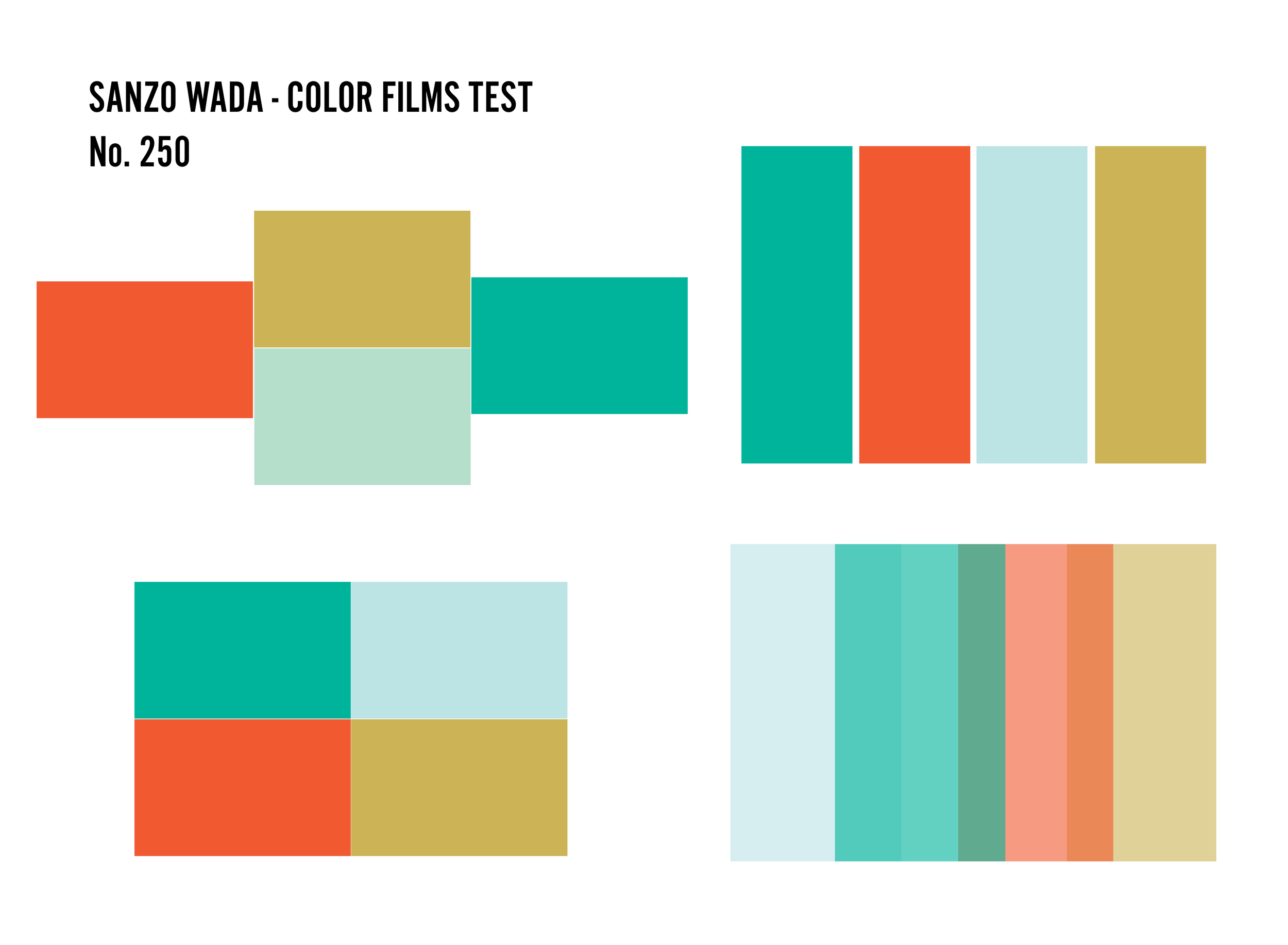
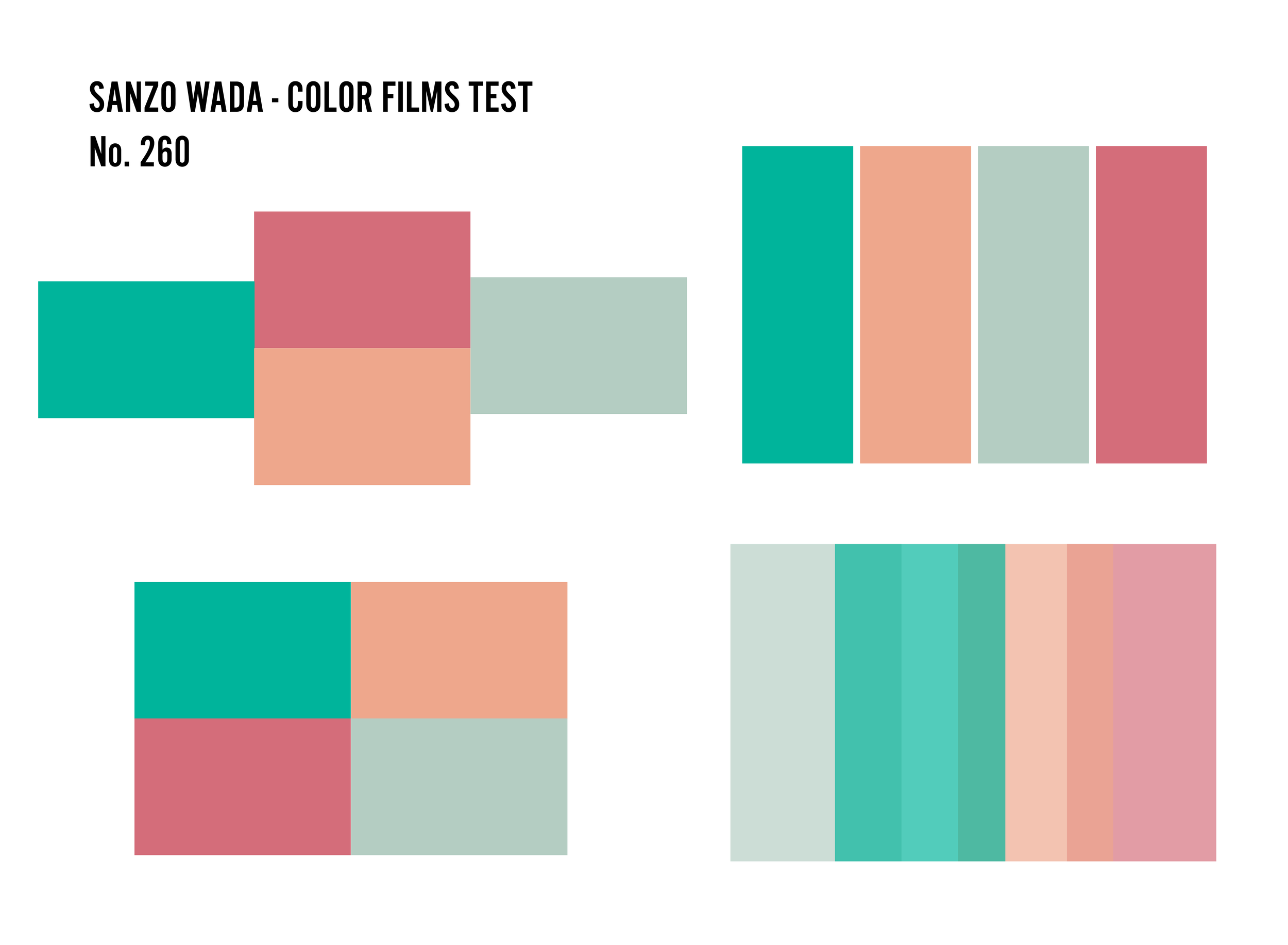
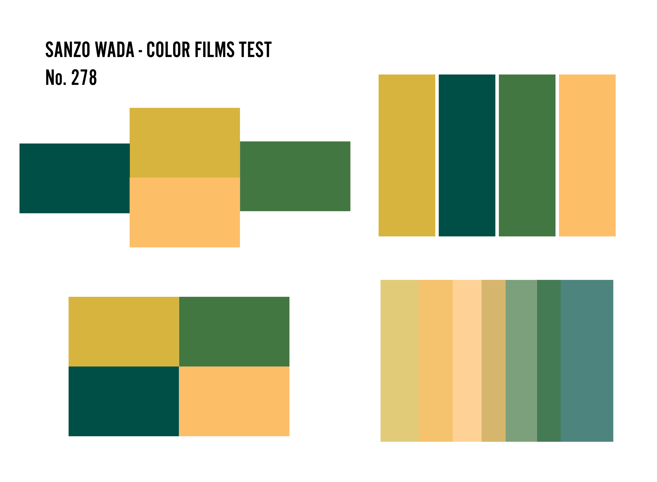
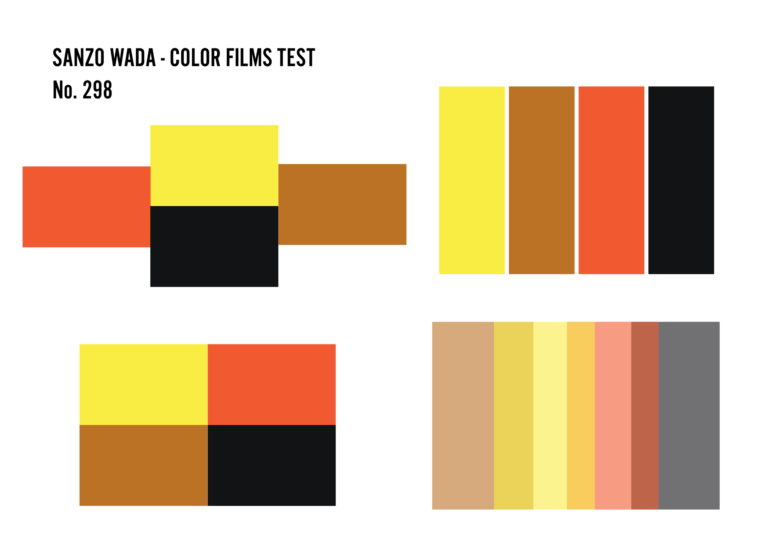
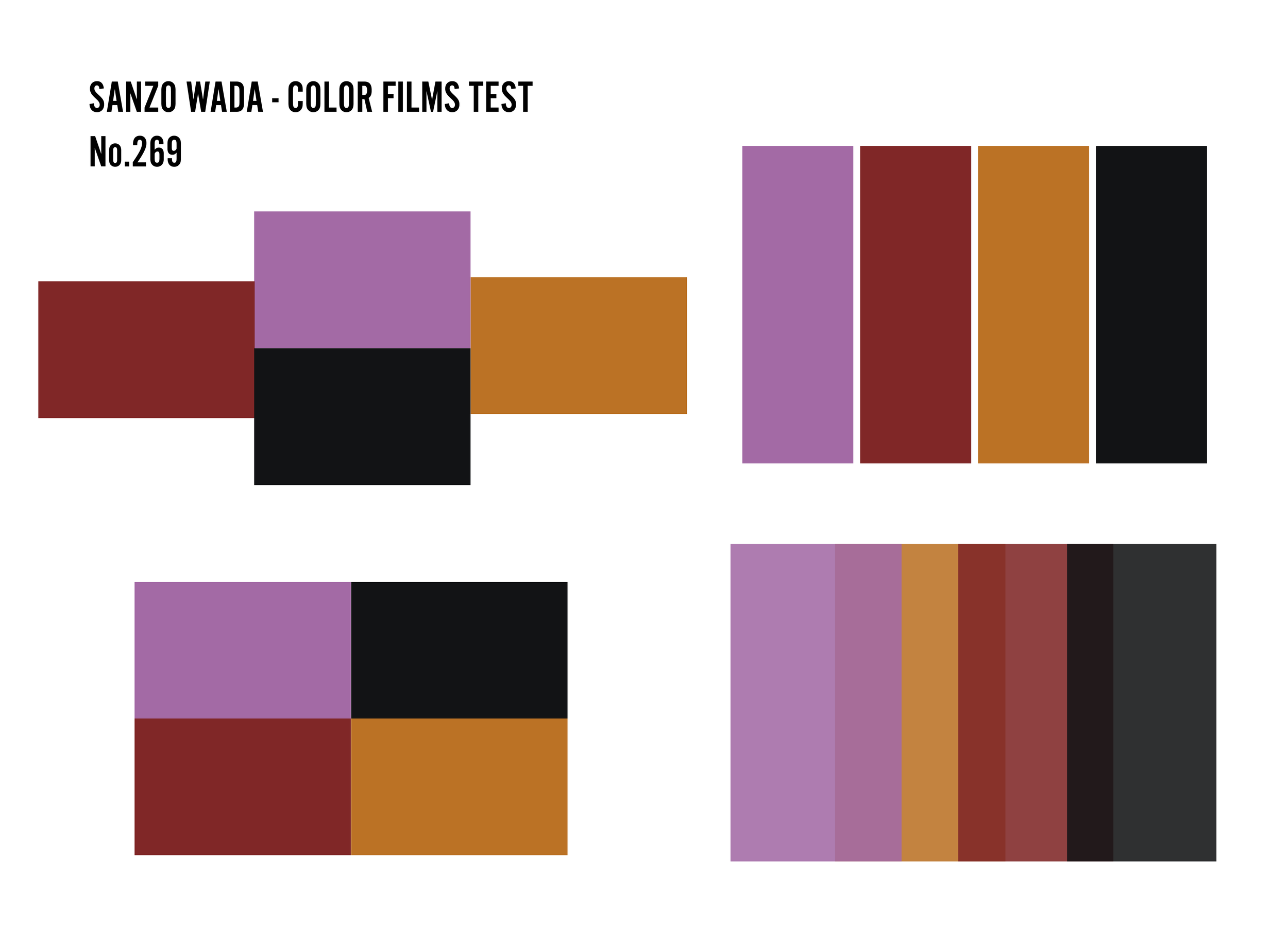
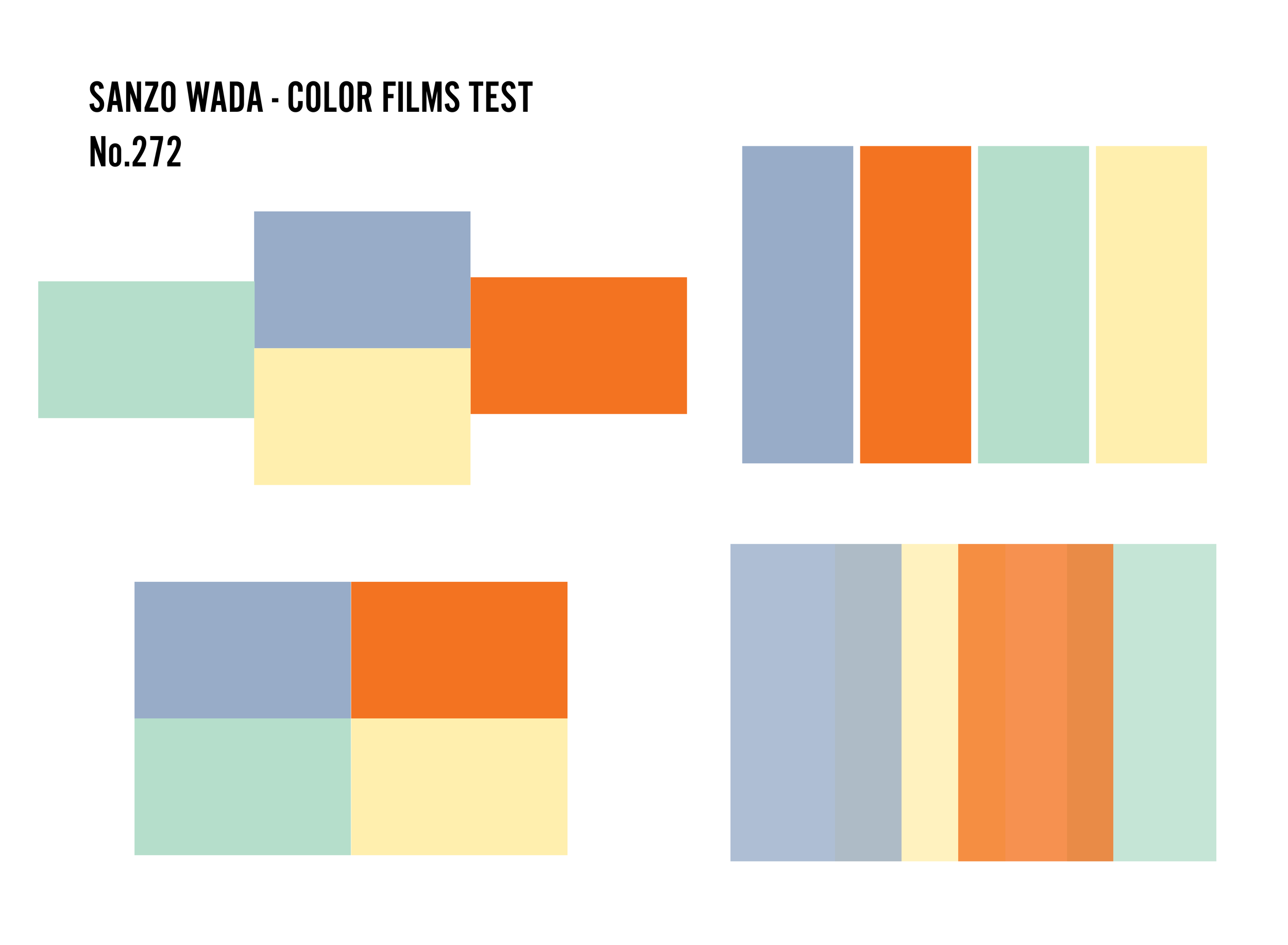
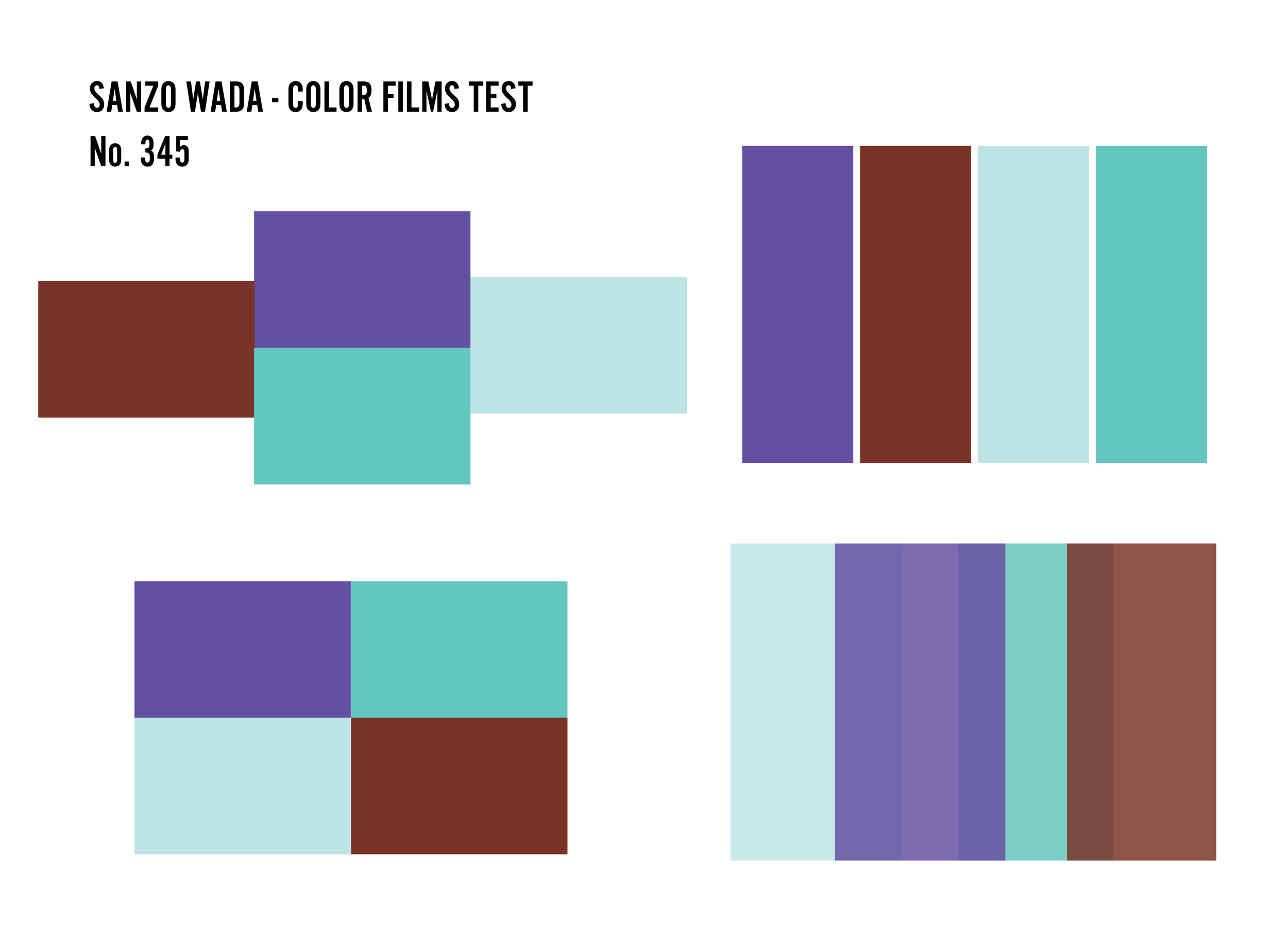
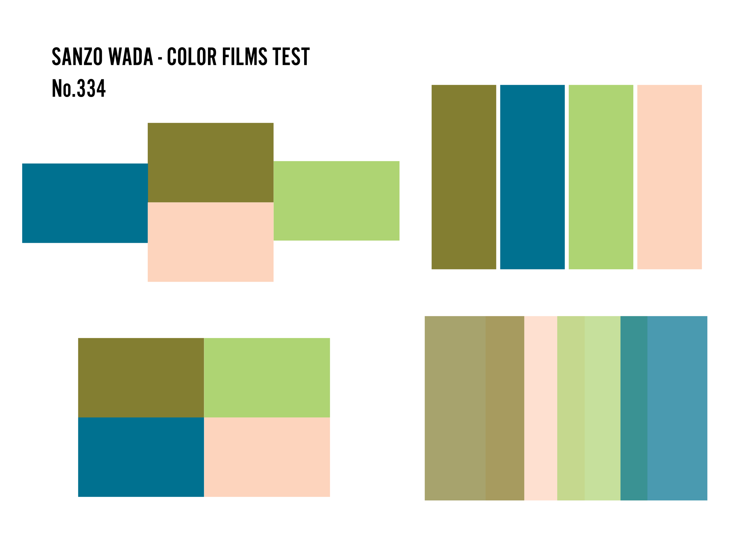
Sanzo Wada identified the 160 Japanese “base” colors — used in everything from kimono fabric to movie posters — from which he created over a thousand color palettes, and though his work was created in 20th century Japan, Wada’s groundbreaking studies are a thorough analysis of color aesthetics found through centuries of Japanese art and design. Wada’s diligence and approach to the colors inspired my attempt to recreate the colors from 16 of his palettes on three different types of analog film - Fuji Provia, Kodak Ektachrome, and Rollei Superpan - by using digital RGB recreations of the color palettes to expose onto the films. The experiment took over a year to complete and yielded a set of 128 color films that were used to make 78 compositions, from which 12 were chosen as prints in this new series.
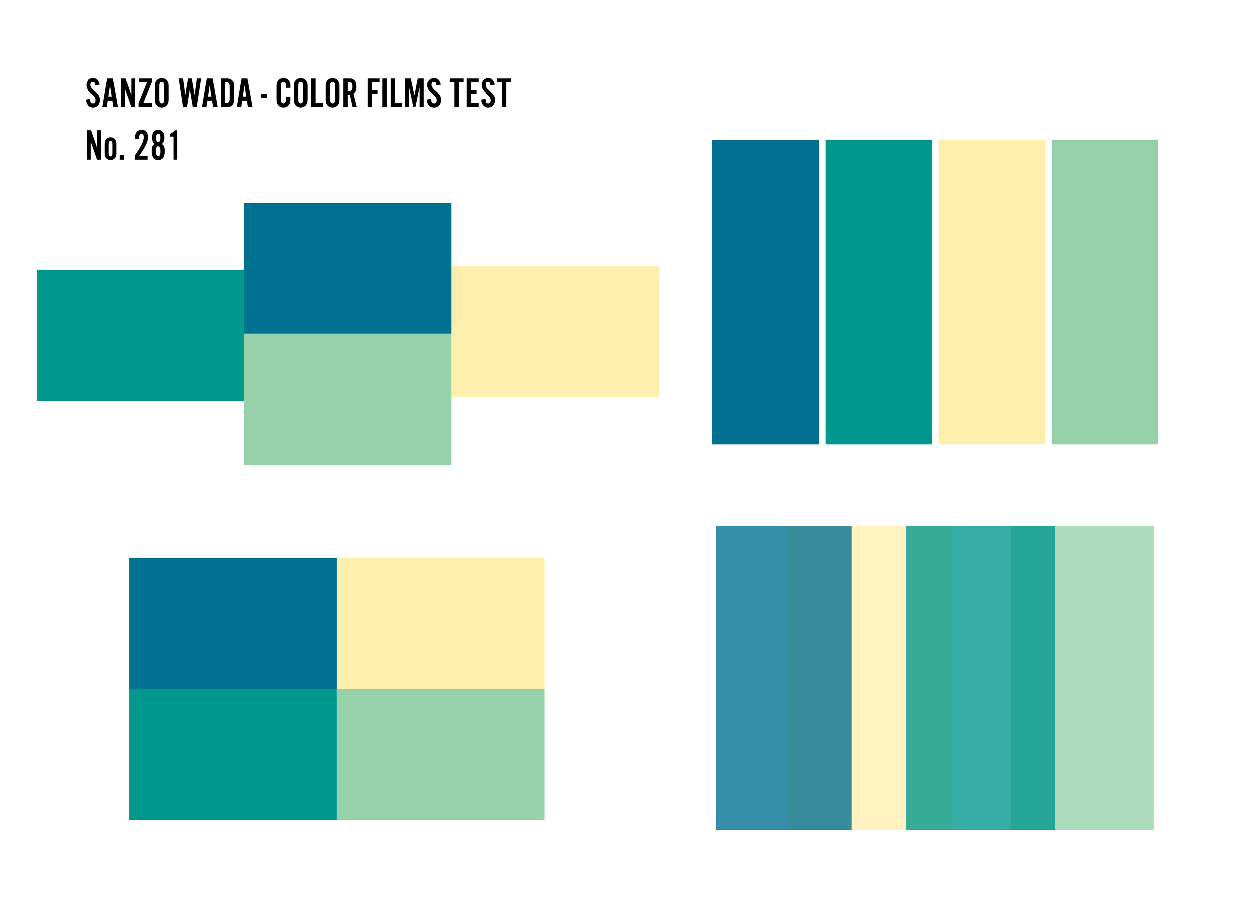
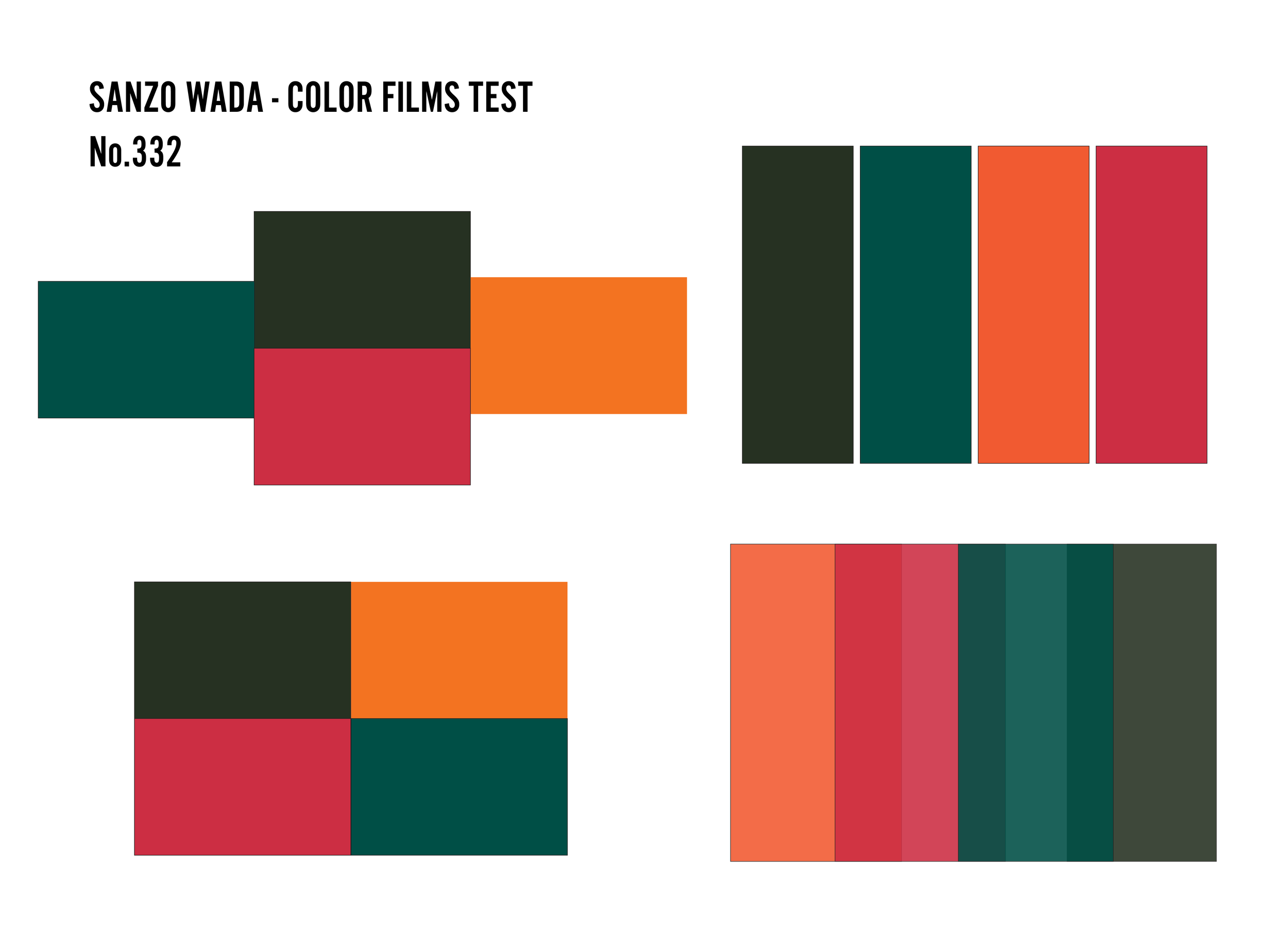
The first step was making a series of digital palettes which translated 16 color palettes from the book into RGB colors, as you can see in the gallery below:
One of the underlying themes of the project is documenting the application of this vintage color theory to my contemporary brand of photographic art, which in many respects is itself a long-running experiment in color theory - pure color using analog and digital processes. Exploring the relationship of translating color from the computer to television to film has really been at the core of my abstract photography experiments and artwork, especially in the Color Films and Color Zen series.

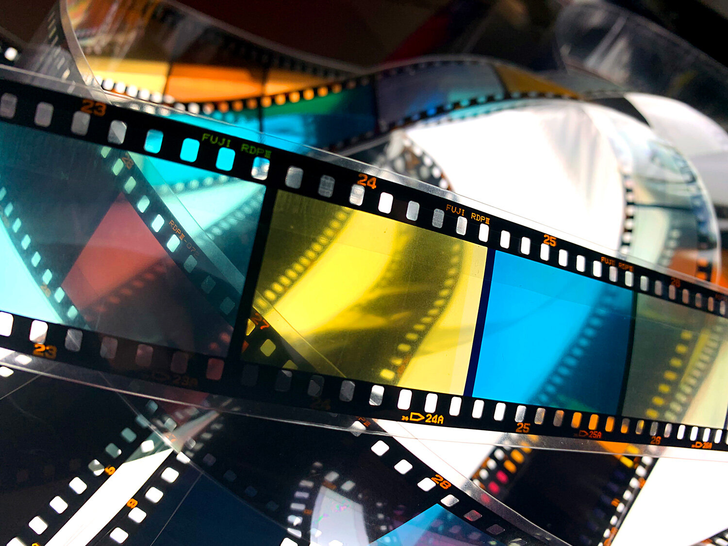
Shooting a color field on the Provia 35mm slide film. I have to make notes of the exposure settings for each shot to reference once the film is developed.

Checking the film to find the correct exposure settings - the ones producing the most vibrant colors.
I recently finished the creating and photographing the TV color fields comprised of the colors in the 16 combinations I chose to work with. Shooting color fields requires a good bit of testing to get two different variables aligned correctly. The color must display well on the screen, and film the film needs to be metered and exposed properly.
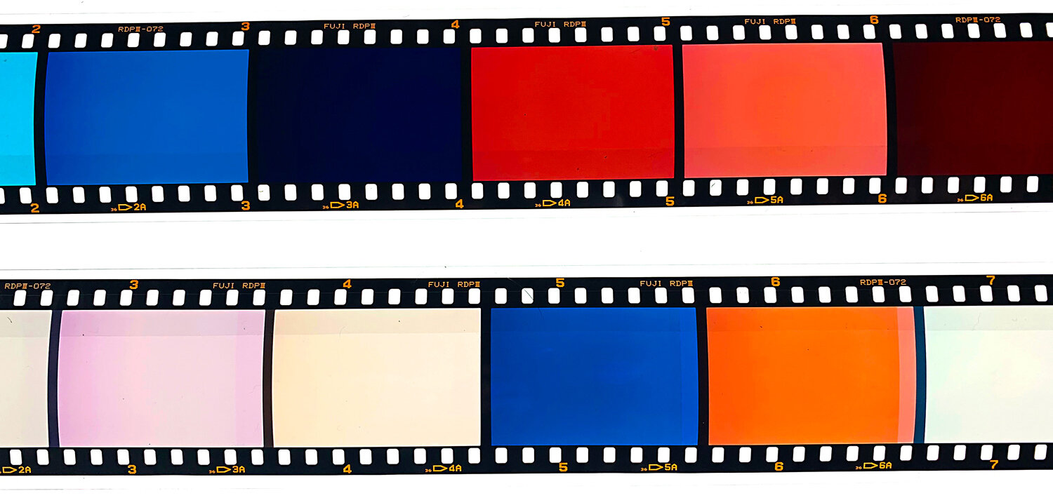
Strips of the 35mm color tests - in this round I tested both 35mm and 120 film.
Over the years I have found the right combinations of equipment and conditions to create accurate and vivid color fields on film, however I always have to run these (expensive!) color tests as the colors always change depending on the project. Now that these are back, I have the best exposure settings for the Sanzo Wada color combinations and can confidently shoot more rolls to get the best photos to use in the pieces!