
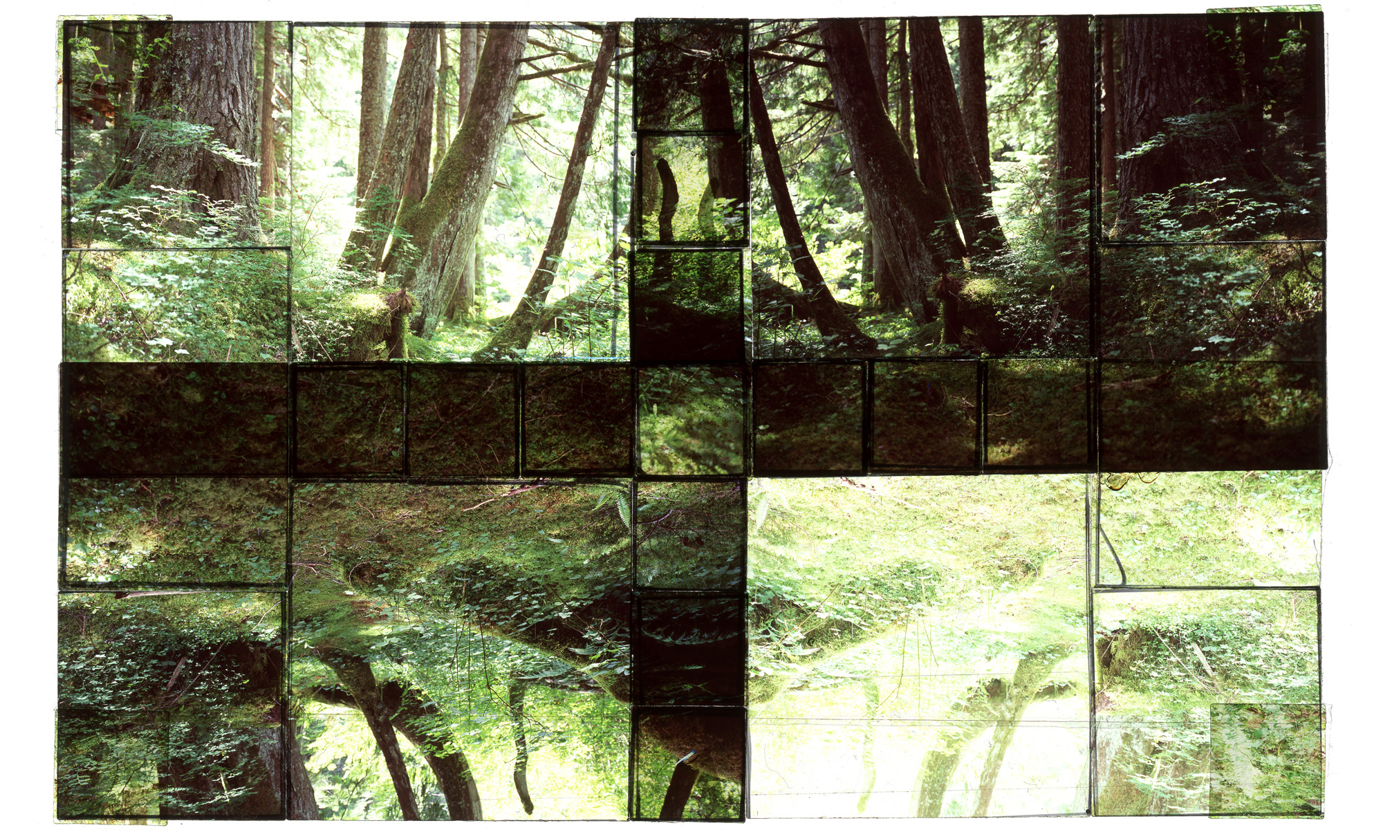
New Mt. Rainier Compositions, Mixed Results
I recently completed some new work from film I shot in Mt. Rainier National Park - to mixed degrees of personal satisfaction. I was tempted to call this set "sketches" because I don't think they're pieces I'd try to exhibit or sell, but they aren't exactly failures either. So for now I'll just put them here on the blog and journal the process and my thoughts. I want to encourage anyone reading this and looking at these images to please give me your opinions or feedback on these.
Lets start with these two pieces. The first is comprised of three extremely overexposed shots and a frame built from pieces of underexposed shots. I experimented with a new geometric design that required me to draw square guides on the film before I cut them. I thought this might be a good effect at first, however it completely obscures the film edges and therefore obscures the overlapping facet of the process. It wasn't obvious after I created it, but it was a big disappointment when I scanned it. For me, those marker outlines just won't work when printed at large scale. Not to mention my art-brut frame pieces being too thick and way too haphazard. However the geometric design idea is good, I'll use it again, and overlap of the film in the middle is definitely dream imagery. And
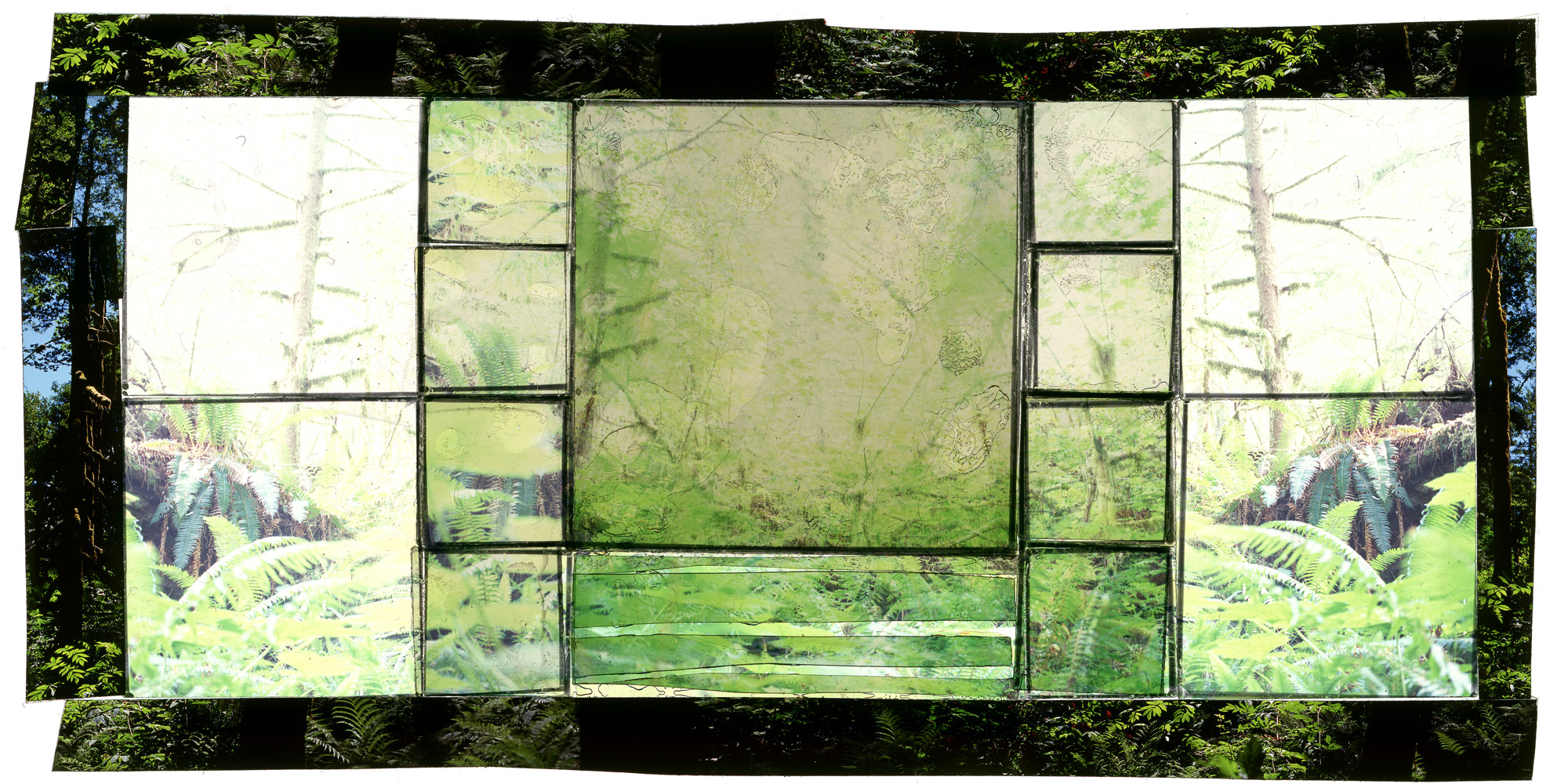
This one is more successful owing to the thinner border and less-noticeable marker lines around the shapes. Notice the strips in the bottom center of the composition. That's a purely aesthetic choice. It makes for a convenient signal to the viewer that this is handmade.

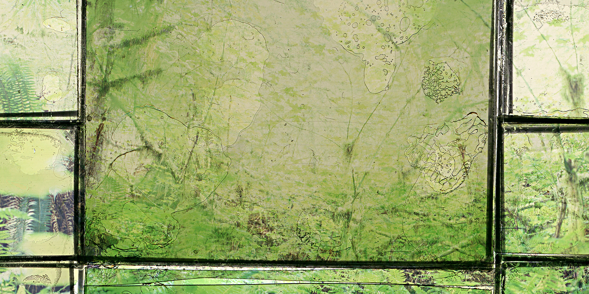
The other new geometric composition below uses four similar shots of the same scene, each with with varying degrees of exposure. I like the varying degrees and the composition itself, but again those damn black marker lines are bumming me out. This is a pretty good composition otherwise. I think I'm going to try to put some text on this in some way.
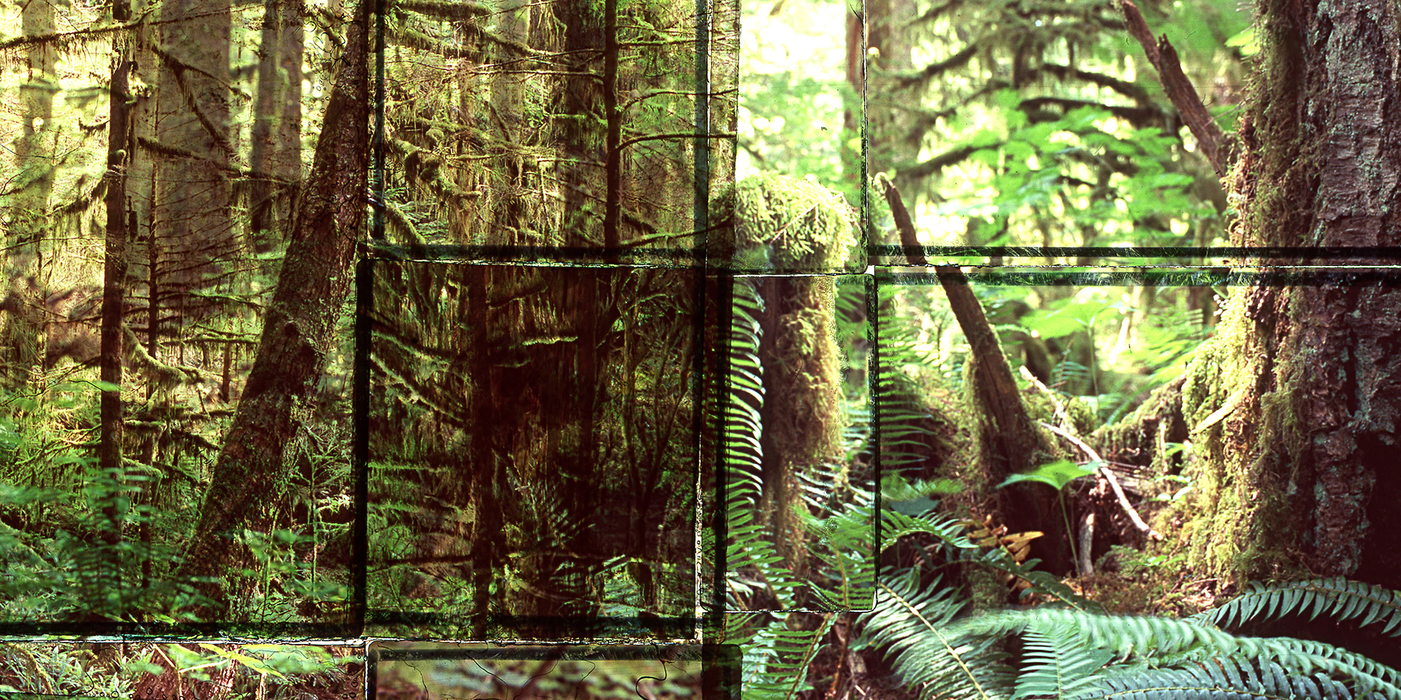
Lastly a piece that has a familiar composition style, with no black marker outlines. I did try a few things in this composition different from how I usually create these square pieces. In this one, the center image is from a completely different photograph - I cut out the overlapped middle portion and replaced it with a view of bright sunlit nurse log.

Usually in these compositions the entire center "row" is comprised of overlapping pieces from the top and bottom rows, and I would put a frame around the overlapped pieces. I also used a center frame of leaf close-ups instead of a solid color. There are also circular "jewels" from four different shots. This piece I consider a success and will probably try to make more like this to create a series for Mt. Rainier National Park.
